MOBILE UIs
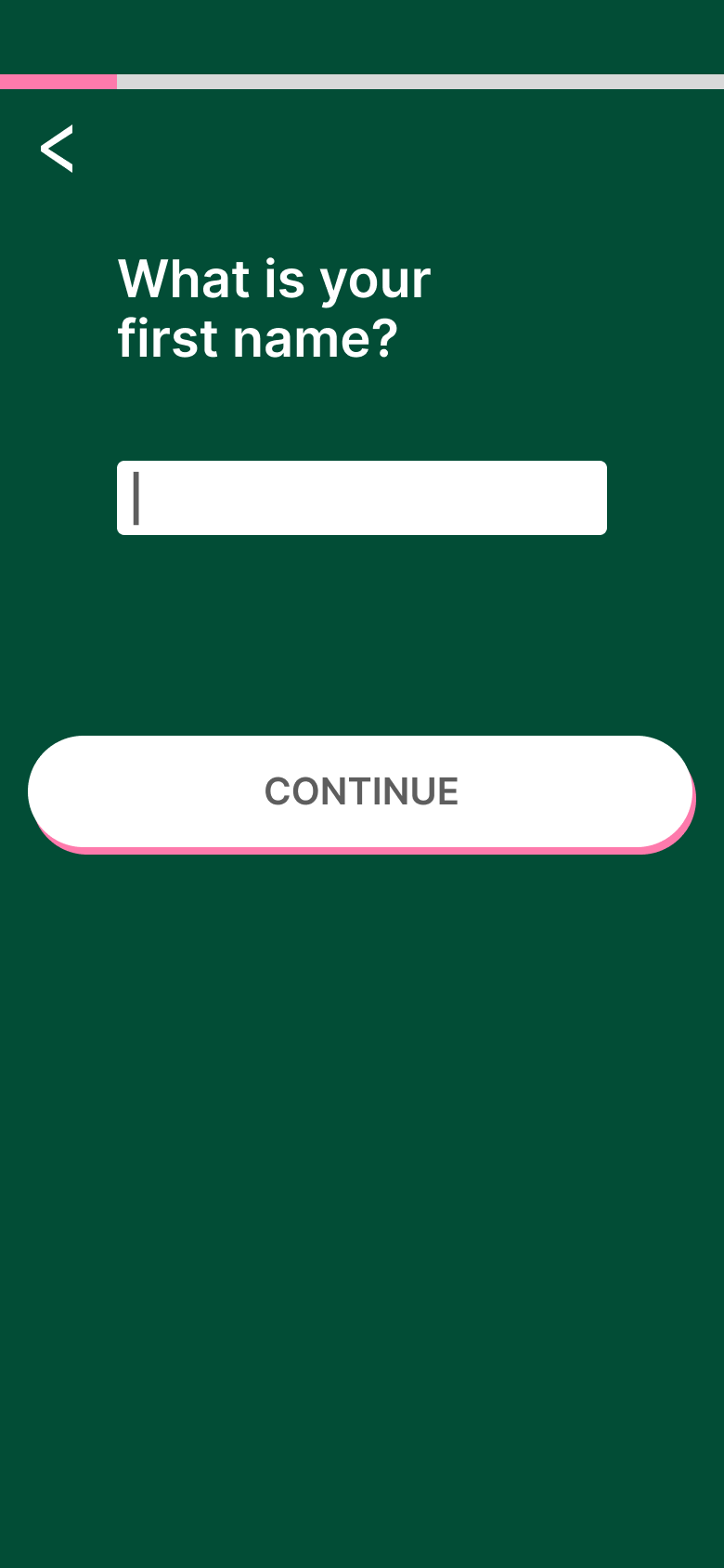
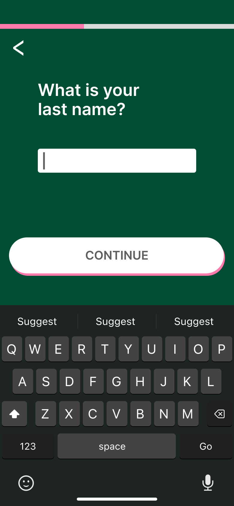
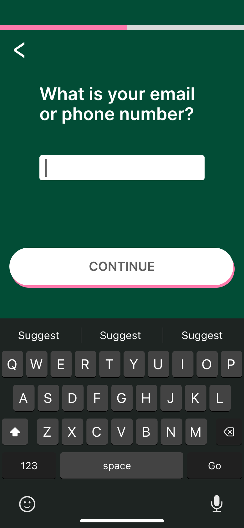
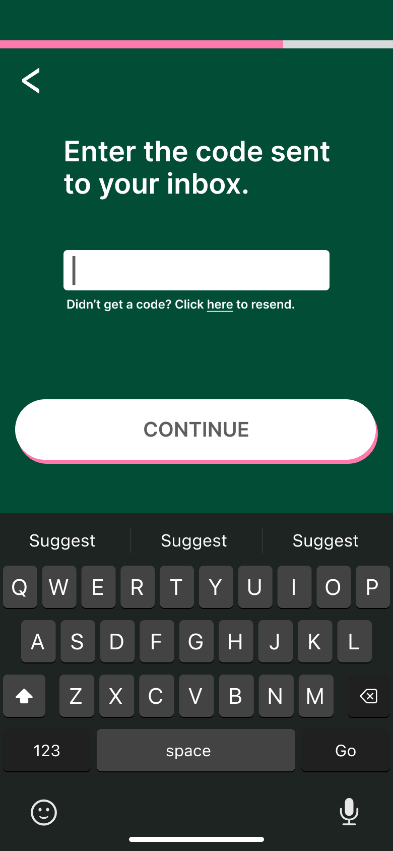
This page showcases two mobile UI projects that allowed me to strengthen my UX design process while experimenting with different industries. The first was a potential mobile UI for MyPinecone, a CRM application aimed at simplifying contact management. This project required researching competitors, creating user personas, and conducting UX trials to craft a clean, intuitive experience. Focusing on the sign-in flow while refining menus and main pages, I worked to minimize clutter and keep the interface user-friendly as data grew.
The second UI was for Medobar, a Syracuse-based beekeeping company I studied as part of an entrepreneurship case analysis. My task was to envision a potential look for a mobile app that would support beekeepers with management tools and resources. While the goals and audience were very different from MyPinecone, the process was similar—starting with research and moving into layout, interaction, and visual refinement. Both projects pushed me to balance functionality with clarity, and together they showcase my adaptability as a designer and my ability to tailor UI to very different user needs.

MyPinecone
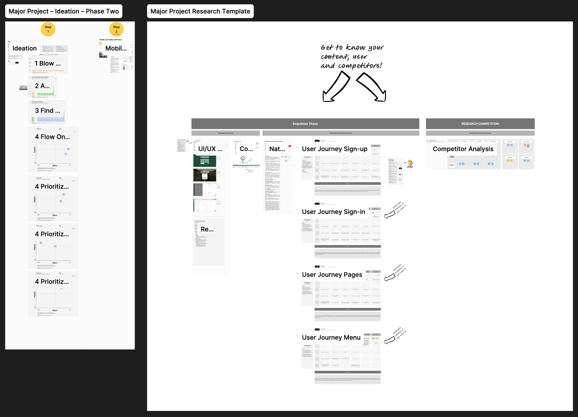
MyPinecone research and competitor notes.
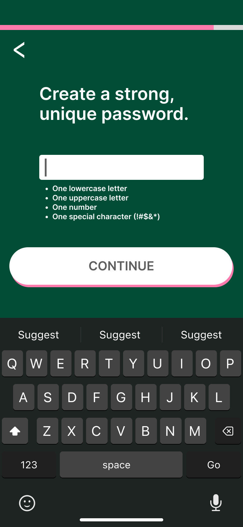
For MyPinecone, a CRM application focused on simplifying contact management, I began by analyzing the existing web version to understand its current strengths and weaknesses. I expanded this research by studying competitor apps and asking a friend to go through the flows of the website while I observed. From this research, several issues became clear: the sign-up process was unnecessarily difficult, there was significant clutter in the interface, and once users signed in, the overall direction of the app was unclear. In contrast, competitor apps presented themselves in a far more polished and user-friendly way, with smoother onboarding flows and cleaner visual hierarchies. This made MyPinecone’s gaps even more apparent, reinforcing the need for clarity and intuitive structure. These insights became the foundation for my design approach, guiding me toward solutions that emphasized simplicity, usability, and a stronger first impression for new users.
Using the insights from my research, I redesigned the sign-up flow to be cleaner and more approachable. The original process was long, confusing, and filled with unnecessary steps that created friction right at the start. My updated version condensed the flow into fewer, clearer screens with progress indicators and straightforward instructions. I emphasized hierarchy through stronger typography, more consistent spacing, and simplified input fields, giving users confidence that they were moving smoothly through the process. By removing clutter and improving the visual structure, the sign-up became less of a hurdle and more of a natural first step into the app.
I also overhauled the menus and main screens, which previously suffered from an overwhelming amount of clutter and unclear navigation. To solve this, I reorganized the layout to group related features together and streamlined the navigation so users could find what they needed without hesitation. The updated menus highlight the most important functions of the app while maintaining a cleaner look that mirrors the polish of competitor apps. Consistent iconography and better use of white space make the interface feel more modern and professional, while still being easy to use. These improvements gave the app a stronger sense of direction and a visual identity that felt cohesive and reliable.


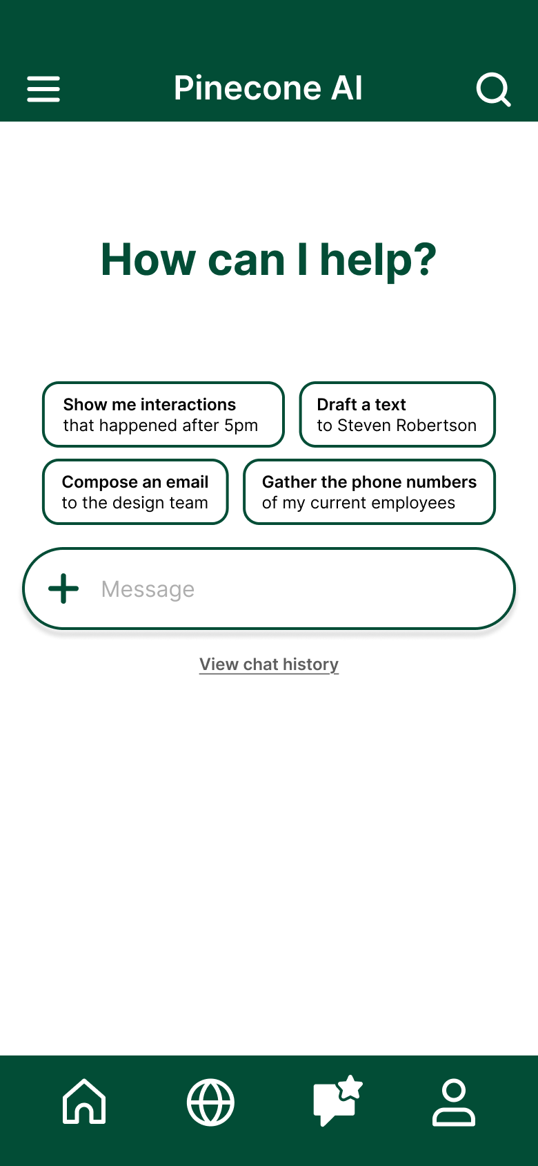
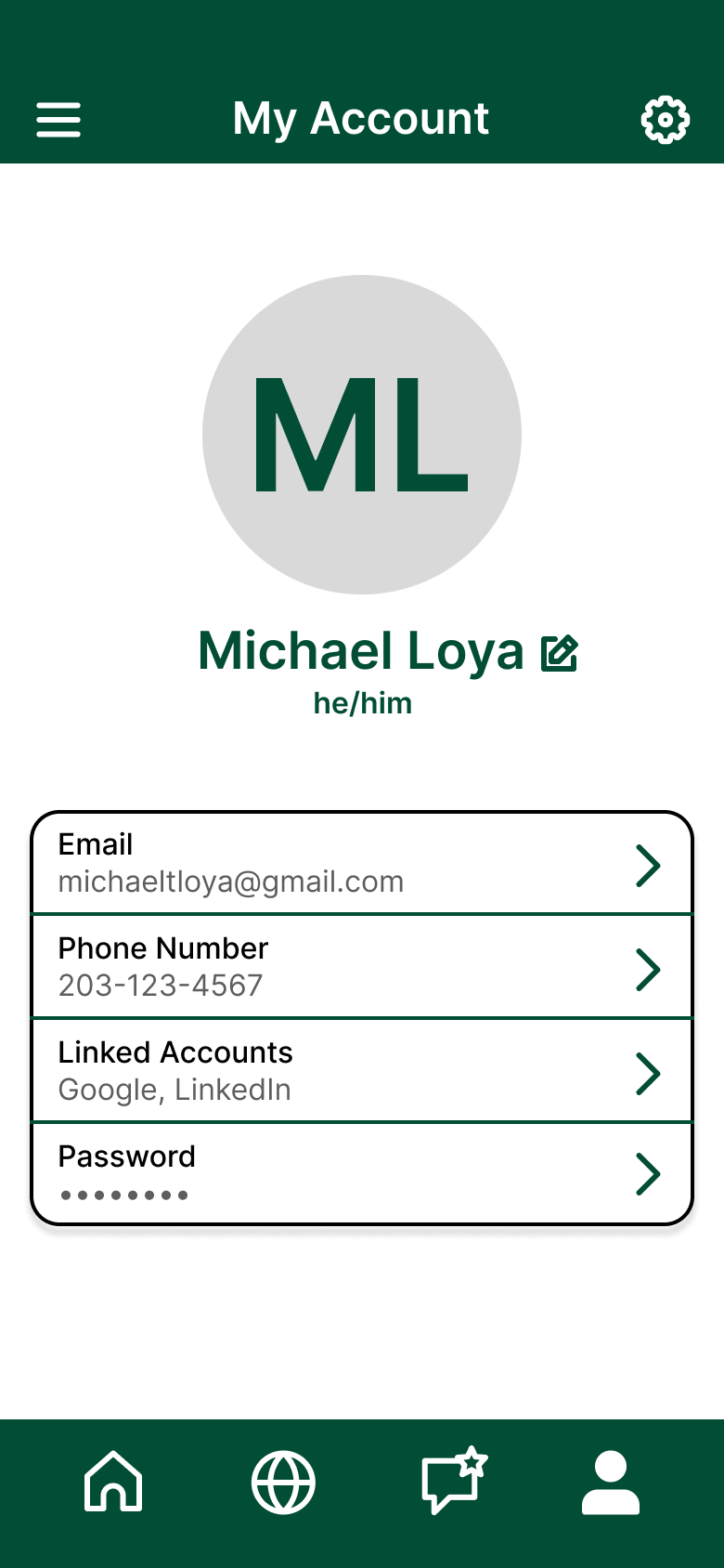
Main screens for sign-up and dashboard navigation.
Interactive prototype built in Figma. Try it here.
To tie everything together, I built an interactive prototype in Figma that showcased the updated flows in action. Walking through the screens—sign-up, menus, and navigation—I was able to demonstrate how the changes created a smoother, more intuitive experience for the user. The prototyping process also allowed me to refine small details like animations and transitions, which gave the app a more polished and professional feel. Seeing the flows in motion highlighted the impact of the redesign, showing how simplifying the structure and reducing clutter transformed the app from confusing and cluttered into something clean, approachable, and easy to use.
Medobar
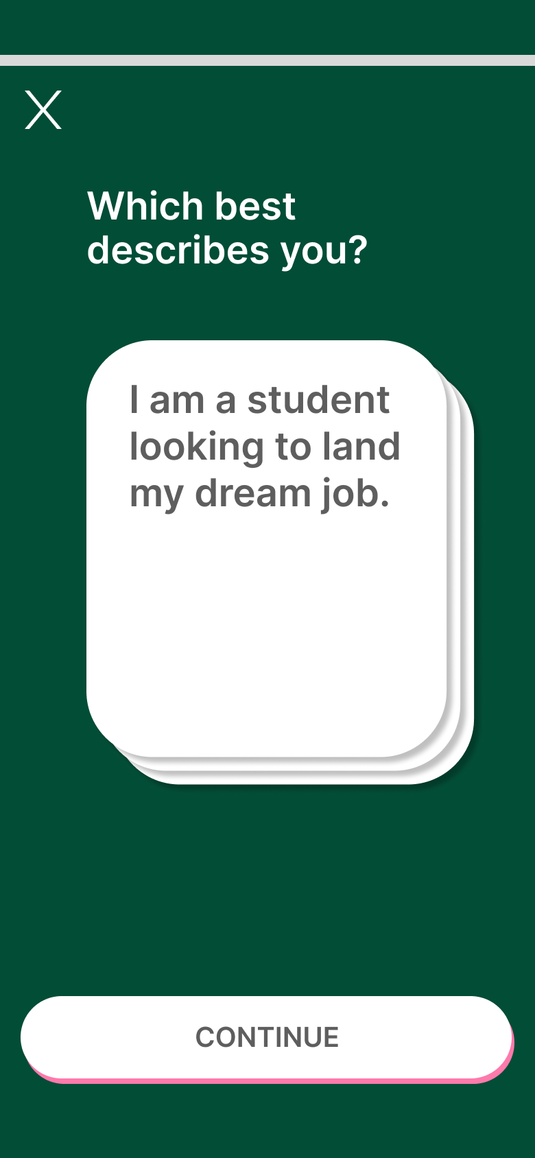
For Medobar, a Syracuse-based company we studied in my entrepreneurship class, I created a quick mobile UI exploration as part of a larger case study. Unlike my MyPinecone project, this one was completed in just a week, since the assignment included multiple other components beyond design. The target audience was financially stable adults 40+ with families who were curious about beekeeping and looking to get started. Because of that, the design needed to feel approachable and extremely simple—something that could guide beginners without overwhelming them.
The onboarding was designed to be as straightforward as possible, asking only a few key questions to help the app understand whether a user wanted to learn about bees, set up their first hive, or explore the basics of equipment and care. Based on these answers, the app tailored the experience from the start. The main interface used a hexagon-based layout inspired by honeycomb cells, with each cell customizable to fit individual needs. This modular structure connected visually to beekeeping while also giving users flexibility.
To tie everything together, I designed a logo for Medobar using shapes derived from the A, B, and O in the Medobar wordmark. This gave the brand a subtle but memorable identity that matched the clean and accessible feel of the app. While not as in-depth as my other mobile UI projects, the Medobar exploration showed how even a short design sprint can produce a user-friendly interface aligned with audience demographics, onboarding goals, and brand storytelling.


High-fidelity mockup built in Figma.


Onboarding process for personalization.